Use today and tomorrow to make sure all of your projects are uploaded to your Blogger and deviantART pages. Also use this time to adjust your settings, add labels, and make your portfolios more complete.
Finally, add a new Photoshop project (of your choice). This IS a required project. Just title it, "Photoshop: My Choice" in your blog.

Thursday, November 21, 2013
Wednesday, November 20, 2013
Photoshop: Pop Art #2
We will be continuing our exploration of Pop Art today with a 2nd project. We'll be using the same techniques, but doing it in a different way.

- Begin with a picture of a person (a woman's face works well)
- Go to IMAGE > ADJUSTMENTS > THRESHOLD
- Set your threshold and click "OK"
- Soften the edges with a FILTER > BLUR > GAUSSIAN BLUR
- IMAGE > MODE > GRAYSCALE
- IMAGE > MODE > BITMAP
- Halftone
- Frequency: Down to about 20 for larger dots
- IMAGE > MODE > GRAYSCALE
- IMAGE > MODE > RGB COLOR
- Duplicate the graphic layer (Or select all, copy and paste)
- Insert a blank layer between the graphic layers
- Fill the blank layer with a bright color (i.e. bright red)
- Select the top graphic layer
- Go to SELECT > COLOR RANGE and choose the white color with a "fuzzy" selection area
- Press DELETE (which should reveal the color underneath)
- Click the bright color layer, do a CTRL+A (Select All) and delete. This will reveal a white background
- Use some colors and a paintbrush with hard edges to paint features (i.e. lipstick or eye color)
- You can mute the colors a bit with the Opacity tool

Tuesday, November 19, 2013
Photoshop: Pop Art #1
Today we're going to be creating a Pop Art picture; something that would have been popular on album art in the 80's or on T-shirts from the 2000's. :)
To begin with, choose a picture with distinct lines to make it easier to erase out the background.


Here are some interesting Pop Art backgrounds you can try out:


To begin with, choose a picture with distinct lines to make it easier to erase out the background.
- Make a copy of the picture layer.
- Between the two picture layers, insert a new layer and fill it with a bright color.
- Erase the background (everything but the subject) on the top layer. You should see the color coming through behind your subject.
- Perform a Threshold: IMAGE > ADJUSTMENTS > THRESHOLD
- FILTER > BLUR > GAUSSIAN BLUR (just smoothing a little)
- Right-click on your top layer (the picture you just blurred) and do a DUPLICATE LAYER and then under "Document" choose "New", giving it a name like "Temp"
- Convert your new document to Gray-Scale: IMAGE > MODE> GRAYSCALE (just to remove any color variation)
- Convert your document to a bitmap: IMAGE > MODE > BITMAP
- Flatten Layers
- Halftone Screen
- Round
- Frequency (Start with 30 but play with this setting for a better effect)
- Go back to Grayscale: IMAGE > MODE > GRAYSCALE
- Size Ratio: 1
- Back to Color: IMAGE > MODE > RGB COLOR
- Right-Click the Layer then Duplicate Layer
- Document: Choose the original document
- Go back to your original document where you can see your black & white on top of the other layers.
- Hold the ALT button while hovering between the top two layers and click on the "double bubble" to connect the two layers.
- Try this with a few different pictures to see how the process works.


 |
| Done by Adriana French |


Monday, November 18, 2013
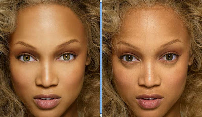
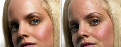
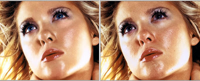
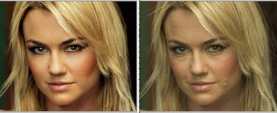
Photoshop: Virtual Makeover / Photo Retouching
Today we are going to explore doing a virtual makeover. In a previous assignment we took a face with scratches or pimples and retouched it to make it look a little more natural. Today we are going to go a little further by beautifying someone. In short, we are going to take a photo of someones face and smooth wrinkles, remove blemishes, adjust colors, brighten teeth and eyes, etc. We can even try some "virtual makeup".
Remember that we aren't trying to make anybody into a super model, we're simply trying to bring out their natural beauty.
You can search for "no makeup" on Google Images for some examples. Click here to see a few: [LINK] or [LINK].
Here are some celebrities [mostly] without makeup: http://www.funzug.com/index.php/celebrities/celebs-without-makeup-portraits.html
Here are some examples of Virtual Makeovers:
If you would like to follow along with a video tutorial, you can check these out:
Remember that we aren't trying to make anybody into a super model, we're simply trying to bring out their natural beauty.
You can search for "no makeup" on Google Images for some examples. Click here to see a few: [LINK] or [LINK].
Here are some celebrities [mostly] without makeup: http://www.funzug.com/index.php/celebrities/celebs-without-makeup-portraits.html
Here are some examples of Virtual Makeovers:


 |
| A Sample Image |
Friday, November 15, 2013
Additional Photoshop Functions
Today we will be looking at some different Photoshop functions:
 Today we will begin experimenting with Photoshop Actions. Actions are basically macros -- small scripts that do a series of tasks that you would normally need to perform one at a time.
Update: We viewed available Actions, found how to use "hidden" Actions, and how to load external Actions. We experimented with a few Actions on images and text.
[Note to Self: Update later with examples, links, etc.]
- Brushes
- Actions
- Resources
- Fonts
- Brushes
- Actions
- Stock Images

Update: We viewed available Actions, found how to use "hidden" Actions, and how to load external Actions. We experimented with a few Actions on images and text.
[Note to Self: Update later with examples, links, etc.]
Thursday, November 14, 2013
Photoshop: Blogger Title Graphic / Header
Today we're beginning a "title graphic" or "header" for our Blogger page which include the title of your page and some graphic elements. The following examples demonstrate the concept.


You might want to go into your blogger settings and check a few things before beginning:
- What is the width of your blog?
- What colors or styles will fit with your blog?
- Will a graphic (or maybe your logo) fit on the header?
Wednesday, November 13, 2013
Photoshop: Create a Tiled Seamless Graphic
Today we will be creating a graphic that tiles without seams. It can be used on a web page, a Windows wallpaper, a 3D graphic, etc.
- Begin by finding a graphic that you can use to create a "seamless tiled graphic" from (i.e. grass, pebbles, leaves, geometric shapes, etc.)
- Copy the graphic and paste it into a new Photoshop document
- Select FILTER > OTHER > OFFSET
- Enter a number of pixels to "offset" your image (you should see a distinct line appear on the image where the edges of the picture were)
- Use the Clone Stamp tool, copying/pasting, the healing brush, etc. to make the lines "disappear" as much as possible.
- Offset the picture again to see if any new lines are visible and correct (if necessary).
Here is a YouTube video demonstrating this process:
Tuesday, November 12, 2013
Homework: Plan a Production Logo
The plan this year is for every student in here to have a fictitious business (which could become an ACTUAL business if you choose). This could be a photography business, a video editing business, a digital arts, business, etc. Think about some names that you could call your business -- and think about how that name limits you, identifies you, or advances you.
The other thing to think about when starting a business is what sort of logo would your business have? Nike has a swoosh. Disney has a castle with a Disney signature. Playboy has a rabbit. What would YOUR business have?
Once you have an idea for a business name, you will need to think about what your logo will look like. Today we will begin planning out a production logo -- a company logo which is shown before a movie, TV show, or video game, or even printed on a letterhead or business card. Logos are also used to develop company branding. The Raiders shield, the Nike swoosh, or the Chevron standard. It becomes the symbol by which a company is identified.
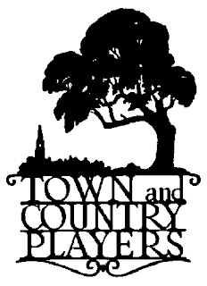
A good logo should be easily recognizable, fairly simple, and be able to be reproduced with limited colors -- including black and white. When I taught graphic design before, I drew a whiteboard full of logos (see below) which are easily recognizable (or were at the time) and I used only one color -- black.


Still confused about what makes a good logo? Check out this logo design tips article or from a professional logo designer for some extra information.


I ran across these applications while researching movie company names:
 Obviously if you're just starting out in photography or web page design or independent movie production, a logo's not a huge deal... but it potentially could be.
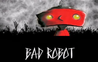
Sometimes a logo comes out that is iconic. Bad Robot made a big name in television and is now doing motion pictures. The "Bad Robot" doesn't really have anything to do with movies or television or anything else... but it's memorable.
If I was starting my own photography or video business, I might think about some general names:
- Griffith Enterprises
- Lake County Studios
- AskGriff Productions
- Konocti Industries
- Kelseyville Photography
So looking at those, there are a couple of problems. First, names like Griffith Enterprises are a little obscure. If you heard someone say, "I went to Griffith Enterprises" you would have no idea why. Lake County Studios is a little better, but people aren't really going to know what sort of studios it is -- and it will limit you if you ever want to do work in another county or state. AskGriff Productions is also too vague. Konocti Industries is not only too specific, but also -- industries? Do I manufacture something> Kelseyville Photography is pretty straightforward, but what if you want to do video? Web design? What if someone is in Lakeport or Clearlake and they would rather hire someone from their home town?
When choosing a business name, keep the following tips in mind:
- Choose a name that appeals not only to you but also to the kind of customers you are trying to attract.
- Choose a comforting or familiar name that conjures up pleasant memories so customers respond to your business on an emotional level.
- Don't pick a name that is long or confusing.
- Stay away from cute puns that only you understand.
- Don't use the word “Inc.” after your name unless your company is actually incorporated.
- Ask family or friends if it makes sense -- and then ask them, "Could it be seen as offensive in ANY way?" (Sometimes these little things will pop up and kill a business)
Once you have an idea for a business name, you will need to think about what your logo will look like. Today we will begin planning out a production logo -- a company logo which is shown before a movie, TV show, or video game, or even printed on a letterhead or business card. Logos are also used to develop company branding. The Raiders shield, the Nike swoosh, or the Chevron standard. It becomes the symbol by which a company is identified.
A good logo should be easily recognizable, fairly simple, and be able to be reproduced with limited colors -- including black and white. When I taught graphic design before, I drew a whiteboard full of logos (see below) which are easily recognizable (or were at the time) and I used only one color -- black.

Here are some color examples of logos:
 Once you have a basic logo in black and white, it's easy to use Photoshop to create a variety of modifications of your logo. The "Espresso A-Go-Go" logo (below) demonstrates that.

Another example is the NBA logo (below) showing black and white, 2 colors, and 2 colors with an effect. Note the differences between the heads/ears of the three examples. Even though they are slightly different, they are still recognizable as the NBA logo.

Your logo should be describable ("It's a big golden M"), effective without color, memorable, and scalable.
 Remember, it's okay to keep it simple -- and stick to what works. This example shows two similar companies and their different approaches to logo design and corporate branding:

I want you to conceive a logo that depicts you, your style, your business, etc. Begin sketching ideas on paper for now and turn in your paper(s) on Friday. You might think of something local (i.e. Konocti or Lake) or use your name (i.e. Griffith Enterprises, Griffith Inc., etc.). Don't over-complicate things or be too literal -- look at all of the most recognizable logos and you will notice that very few demonstrate what the company actually does. For example, if your company was called Sun Beach Productions you don't have to use a sun shining on a beach.
You may want to try V Entertainment -- or W Creations -- or X Productions -- or Y Enterprises -- or Z Designs. Something that will allow you to do a variety of different things -- such as graphic design, web design, multimedia, video editing, or whatever.
You may want to try V Entertainment -- or W Creations -- or X Productions -- or Y Enterprises -- or Z Designs. Something that will allow you to do a variety of different things -- such as graphic design, web design, multimedia, video editing, or whatever.
Here's a demonstration of the logo development process:

Finally, I would like you to find some examples of well-designed logos [and poorly designed logos] and bring them in to class. Check newspapers, junk mail, catalogs, etc. I will use the examples to showcase the differences.


You will soon be doing your logo design in Photoshop. Your logo should be at least 1024x1024 pixels, have a white background, and be ONLY BLACK (at least at this point -- we will add color later). Here are some examples of black and white logo's [these are for car companies, obviously] to show you that it's possible.
And speaking of "The Bad" and "The Ugly"... here are some more examples of logo design gone wrong:


 |
| Click Image to Enlarge |
A few more well-known logos in black and white:

This was a tribute to Apple founder Steve Jobs after his passing:

Finally, here are some examples of student-created logo's:


There are many websites and blogs out there that focus on logos and logo design. I will list some as I discover them:
Finally, you might want to consider how your logo or production company name will sound if you ever created one of those fancy animations you see at the beginning of movies or video games. Here are some examples:
And here are some more. Note in the beginning the Disney logo (the castle) was relatively simple in design. They have now moved to a fully 3D rendered castle with a river in front at the beginning of their movies.
I ran across these applications while researching movie company names:
- http://www.generatorland.com/usergenerator.aspx?id=2659
- http://www.generatorland.com/usergenerator.aspx?id=210
- http://www.switchplane.com/awesome/business-name-generator/

Also, here is a list of existing film production company names:
 Obviously if you're just starting out in photography or web page design or independent movie production, a logo's not a huge deal... but it potentially could be.
Sometimes a logo comes out that is iconic. Bad Robot made a big name in television and is now doing motion pictures. The "Bad Robot" doesn't really have anything to do with movies or television or anything else... but it's memorable.
Subscribe to:
Posts (Atom)